On September 16, 2026, at 8:00 p.m. Paris time, the FOMC raised its policy rate by a quarter point. Within the same minute, a second image lit up traders’ screens: a cloud of 18 dots, 16 of them placed above the new range for the end of the year. That is the Fed’s dot plot. The decision tells you where the rate stands that evening; the dot plot tells you where the Fed’s leaders think they will take it — and the market has to digest both messages at once.
This guide teaches you to read it the way you would on meeting night, in five minutes: who places the dots (not just the twelve voters), how to read the median, its shift and the spread of the dots, what the “longer run” dot is worth, why price moves at 8:00 p.m. — or at 7:00 p.m. on certain weeks — and what the dot plot is not. It is current as of October 7, 2026, with the official September projections; the next dot plot will come out on Wednesday, December 9, 2026, at 8:00 p.m. Paris time.
Key takeaways:
- The dot plot is a chart from the Summary of Economic Projections (SEP), published four times a year, in March, June, September, and December. Each dot is one Fed official’s projection for the fed funds rate at the end of each year, then in the longer run.
- Up to 19 dots: the 7 governors and the 12 regional Fed presidents, whether they vote or not. There were 19 in March 2026, and 18 in June and September: the Fed chair, Kevin Warsh, did not submit a personal projection.
- The five-minute read: the median for the current year, how it has moved since the previous dot plot, the dispersion of the dots, then the longer-run dot.
- September 2026: median at 4.1% for end-2026, versus 3.8% in June and 3.4% in March, which means one more quarter-point hike by December; longer run at 3.2%.
- 8:00 p.m. in Paris, with the statement released at 2:00 p.m. Washington time — but 7:00 p.m. when the United States has already moved to daylight saving time and France hasn’t yet, as on March 18, 2026. Next date: Wednesday, December 9, 8:00 p.m. Paris time.
- It is not a commitment: in December 2021, the median saw the rate at 0.9% at the end of 2022; the range ended that year at 4.25%–4.50%.
What Is the Fed’s Dot Plot?
The dot plot is the nickname of a chart published by the FOMC, the monetary policy committee of the US Federal Reserve. Its official name is more austere: FOMC participants’ assessments of appropriate monetary policy, each participant’s own view of the policy that fits best. Each dot shows the level that one Fed official judges appropriate for the fed funds rate — the US policy rate — at the end of a given year, or “in the longer run.” In statistics, the term can refer to any chart made of dots; here, it means only the Fed’s.
The Fed doesn’t set a single rate, but a range 0.25 points wide, currently 3.75%–4.00%. Each participant therefore gives the midpoint of the range they consider appropriate, rounded to the nearest eighth of a point. A dot placed at 4.125% means “a 4.00%–4.25% range”; a dot at 3.875% means “3.75%–4.00%,” that is, no change. With that grid in mind, each 0.25-point step corresponds to a quarter-point decision.
The Summary of Economic Projections and Its Dot Plot
The dot plot is just one piece of a broader package, the Summary of Economic Projections (SEP). In it, participants give their projections for real GDP growth, the unemployment rate, and inflation (the PCE index, with and without food and energy) for the current year, the next two or three, and the longer run. Table 1 of the SEP summarizes the medians and ranges; the dot plot shows the fed funds rate dot by dot.
These projections don’t rest on a common scenario: each participant starts from their own idea of “appropriate” policy, the one that best meets, in their reading, the Fed’s dual mandate — maximum employment and price stability. The format came out of an FOMC decision in December 2011, and the first dot plot was published in January 2012, under the chairmanship of Ben Bernanke.
Who Places the Dots: Participants vs. Voters
First nuance, often forgotten: the dot plot doesn’t show the FOMC’s twelve voters, but all the participants. Only 12 officials vote on decisions — the 7 governors, the president of the New York Fed, and 4 rotating regional presidents — but the seven other regional presidents attend the meetings, take part in the discussions, and submit their projections too. Hence a maximum of 19 dots: 7 governors and 12 regional Fed presidents. The voting mechanics and the 2026 lineup are detailed in the complete FOMC guide.
The dots are anonymous: no name is attached, and nothing tells you which dot belongs to whom. Their number varies from one release to the next: 19 in March 2026, 18 in June and September. The difference comes from the Fed chair himself. On September 16, at the press conference, Kevin Warsh said he had not submitted a personal projection, “as in June,” and that the projections were those of his 18 colleagues. Another detail to watch: a participant may decline to give a view on a distant year. In September, one of the 18 projected nothing for 2028 and 2029, and those two columns hold only 17 dots. The right reflex: count the dots before reading the median.
The Year’s Four Dot Plots: March, June, September, December
The FOMC meets eight times a year, but only four meetings come with an SEP: the ones the Fed’s official calendar marks with an asterisk. In 2026, those are the meetings of March 17–18, June 16–17, September 15–16, and December 8–9. The dot plot comes out on the second day, at 2:00 p.m. Washington time, together with the statement and thirty minutes before the press conference. The October 27–28 meeting won’t have one: the next dot plot will come out on Wednesday, December 9, 2026. For 2027, the Fed plans March 16–17, June 8–9, September 14–15, and December 7–8, dates that remain tentative until the preceding meeting confirms them.
How to Read the Dot Plot in 5 Minutes
On meeting night, there’s no need to analyze everything. Four questions, in this order, are enough to understand what the dot plot says — and to compare it with what the market expected. We apply them here to the September 16, 2026 dot plot, copied exactly from the Fed’s official release.
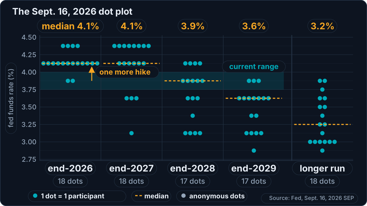
The September 16, 2026 dot plot, copied from the Fed’s official release: one dot per participant, the median of each column, and the longer run on the right.
1. The Median for the Current Year
The median is the middle dot when you rank the projections from lowest to highest; with an even number of dots, it is the average of the two central dots. It is not an average of all the dots, and it is not a committee decision: it is the projection of the “middle” participant. In the September 2026 column, the 18 dots break down as follows: 2 at 3.875%, 12 at 4.125%, and 4 at 4.375%. The two central dots, the 9th and the 10th, are both at 4.125%: so is the median. Table 1 rounds it to the nearest tenth and shows 4.1%.
What remains is to translate it into decisions. The current range, 3.75%–4.00%, has a midpoint of 3.875%. A median at 4.125% therefore means one more quarter-point hike by the end of the year, with only two meetings left, in October and December. The 2 participants at 3.875% project no further hike; the 4 at 4.375% see two more.
One last trap: with an even number of dots, the median can land between two steps. In June 2026, 9 participants saw the rate at 3.625% at most at the end of 2026 (no change or a cut), and 9 at 3.875% at least (one hike or more). The median, 3.75%, displayed as 3.8%, matched no possible range: it signaled a committee split into two equal halves.
2. The Shift Since the Previous Dot Plot
A single dot plot says little; it is its shift from one release to the next that tells the story. Table 1 helps you: under each median, it recalls the one from the previous release. For end-2026, the median went from 3.4% in March (a cut expected during the year) to 3.8% in June (a divided committee), then to 4.1% in September (one more hike after the September 16 one). Same movement for end-2027: 3.1%, then 3.6%, then 4.1%.
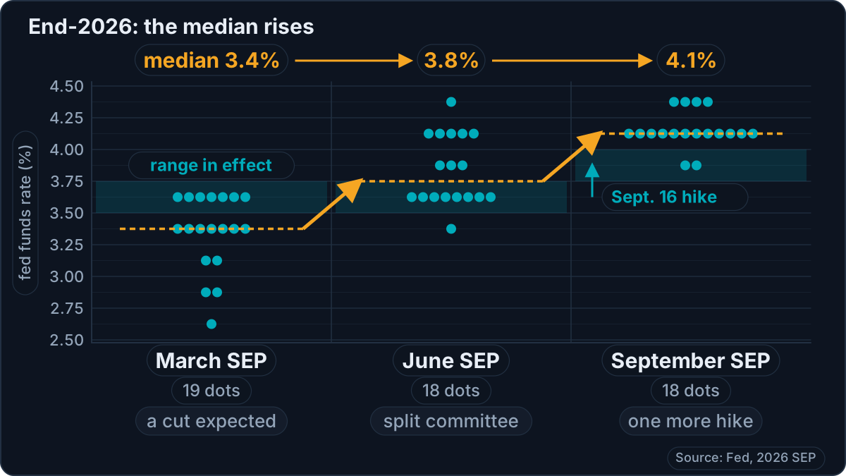
End-2026 as seen in March, June, then September 2026: the median rises one step with each release. It is this shift that carries the information.
In six months, the median participant went from one cut to two hikes over the year. It is that change of course, far more than the 4.1% level, that sums up the 2026 turn. On meeting night, right after reading the median, ask yourself this question: has it gone up, gone down, or held since last time — and by how many steps?
3. Dispersion: Consensus or Divided Committee
Next, look at how spread out the dots are. In September, for end-2026, the 18 projections fit within half a point, from 3.875% to 4.375%, and 12 sit at the same level: the committee agrees on the direction and debates only the number of hikes. For end-2027, the spread widens from 3.125% to 4.375%, a point and a quarter. That makes sense: the further out the horizon, the more opinions diverge, and the less weight the median carries.
Table 1 gives two ready-made measures: the full range, from the lowest dot to the highest, and the central tendency, the core of the projections, which excludes the three highest and the three lowest. A tight core inside a wide range signals a few isolated views at the extremes; if both are wide, the committee has no common course. A tight cloud, on the other hand, gives weight to the median: one or two participants changing their minds aren’t enough to move it.
4. The Longer-Run Dot and the Neutral Rate
The last column, longer run, doesn’t refer to any particular year. It gives the level to which each participant thinks the rate will converge over time, under appropriate policy and in the absence of new shocks. It is what economists often call the “neutral” rate: a cost of money that neither slows nor stimulates activity. To see what that cost changes in practice, reread our explanation of the policy rate.
In September 2026, the longer-run median comes out at 3.2%, versus 3.1% in March and June, with projections ranging from 2.9% to 3.9%. Two readings follow. First, with a range at 3.75%–4.00%, the current rate sits above that median neutral level: in this framework, Fed policy is restrictive, which fits with a hike decided to bring inflation back toward 2% faster. Second, a longer-run dot that edges up, even by a tenth, suggests participants see rates staying durably higher than before: a slow signal, but one closely watched in the US bond market.
The Dot Plot vs. the Market: Why Price Moves at 8:00 p.m. Paris Time
The market doesn’t wait for the dot plot to have an opinion. Futures contracts on the fed funds rate (fed funds futures) trade continuously, and their price contains an implied rate path; free tools like the CME Group’s FedWatch translate it into probabilities, meeting by meeting. The Fed itself follows this path: the minutes of its July 2026 meeting note that the fed funds path implied by market prices had moved up, partly because FOMC communications had been perceived as more restrictive than expected.
Hence the golden rule: price reacts to the gap, not to the level. A median at 4.1% is nothing spectacular if the market expected it; it becomes spectacular if the market was banking on 3.9%. On meeting night, the comparison takes a few minutes:
| What the dot plot shows | Reading | Typical reaction (nothing automatic) |
|---|---|---|
| A median above what the market expected | Hawkish | Yields and the dollar up, pressure on stocks and crypto |
| A median below what the market expected | Dovish | Yields and the dollar down, support for risk assets |
| A median in line with expectations | Neutral | Little movement at 8:00 p.m.: the press conference takes over |
These reactions are only general tendencies. The dollar, Treasury yields, and indices like the S&P 500 are the first affected; crypto often follows, depending on its correlation with equity markets, which we detail in our S&P 500 and crypto analysis. And the first candle doesn’t make the evening: thirty minutes later, the press conference can confirm, nuance, or contradict the reading of the dots.
The prudent reflex, finally: the 8:00 p.m. volatility costs dearly if your position is too heavy. If you trade that night, reduce your size and your leverage, place your stop before the release, and let the first wave pass rather than chase the first candle.
What Time Does the Dot Plot Come Out (Paris Time)?
The dot plot comes out with the statement, at 2:00 p.m. Washington time, and the chair’s press conference begins at 2:30 p.m. Six hours normally separate Washington and Paris: 8:00 p.m. and 8:30 p.m. in Paris, most of the year. But the United States and Europe don’t change their clocks on the same Sunday. The United States moves to daylight saving time on the second Sunday of March and goes back to standard time on the first Sunday of November; the European Union changes on the last Sunday of March and the last Sunday of October. During those windows, the gap drops to five hours, and everything arrives an hour earlier in Paris.
In 2026, the United States moved to daylight saving time on March 8, France on March 29: three weeks out of sync, during which the March 18 dot plot came out at 7:00 p.m. in Paris. In the fall, France goes back to winter time on October 25, the United States on November 1st: a one-week gap, which falls on the October 28 meeting, whose statement will come out at 7:00 p.m. — with no dot plot this time. The March meeting, for its part, has fallen in the window every year since 2021: every March dot plot came out at 7:00 p.m. in Paris, and it will be the same again on March 17, 2027. It is the same trap as with ICT killzones in Paris time: a US time can never be converted with a fixed offset.
| Meeting with dot plot | Release | Washington | Paris | Press conference (Paris) |
|---|---|---|---|---|
| March 17–18, 2026 | Wednesday, March 18 | 2:00 p.m. | 7:00 p.m. | 7:30 p.m. |
| June 16–17, 2026 | Wednesday, June 17 | 2:00 p.m. | 8:00 p.m. | 8:30 p.m. |
| September 15–16, 2026 | Wednesday, September 16 | 2:00 p.m. | 8:00 p.m. | 8:30 p.m. |
| December 8–9, 2026 | Wednesday, December 9 | 2:00 p.m. | 8:00 p.m. | 8:30 p.m. |
| March 16–17, 2027 (tentative) | Wednesday, March 17 | 2:00 p.m. | 7:00 p.m. | 7:30 p.m. |
| June 8–9, 2027 (tentative) | Wednesday, June 9 | 2:00 p.m. | 8:00 p.m. | 8:30 p.m. |
| September 14–15, 2027 (tentative) | Wednesday, September 15 | 2:00 p.m. | 8:00 p.m. | 8:30 p.m. |
| December 7–8, 2027 (tentative) | Wednesday, December 8 | 2:00 p.m. | 8:00 p.m. | 8:30 p.m. |
These times are calculated from the Fed’s official calendar and the clock-change rules of the two continents. To miss nothing, add each date to your economic calendar set to your own time zone — our Forex Factory guide shows how — and recheck the time if the meeting falls in March or late October.
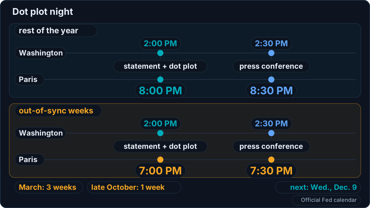
A dot plot evening in Paris time: 8:00 p.m. most of the year, 7:00 p.m. during the out-of-sync weeks.
What the Dot Plot Is Not
Not a commitment. The dots are individual projections, conditioned on what each person expects from the economy. The risk of being misunderstood was known from the tool’s birth: in the December 2011 minutes, some participants worried that the public would take these projections for the announcement of a decided path, rather than for conditional forecasts. The warning still holds.
Not a reliable forecast. The history of dot plots includes many projections that the facts later contradicted, in one direction as in the other:
| Dot plot | What the median said | What happened |
|---|---|---|
| March 2021 | 0.1% at end-2023: 11 of the 18 participants saw no hike before 2024 | First hike in March 2022, range at 5.25%–5.50% at end-2023 |
| December 2021 | 0.9% at end-2022, and no dot above 1.125% | Seven hikes in 2022, range at 4.25%–4.50% at end-2022 |
| December 2023 | 4.6% at end-2024, i.e., three quarter-point cuts | Cuts totaling four quarter points, range at 4.25%–4.50% at end-2024 |
| March 2026 | 3.4% at end-2026, i.e., a cut during the year | A hike on September 16, and a median back up to 4.1% |
A dot plot doesn’t read the future: it photographs what participants think with the data of the moment. When the data change — the 2021–2022 inflation surge is the textbook case — the dots follow. That is why you read its shift rather than its level.
Not the voice of one person. The dots are anonymous, and the Fed chair doesn’t necessarily appear among them: since he arrived, Kevin Warsh hasn’t placed a single dot. To know who thinks what, you have to listen to the participants’ speeches in the following weeks; the dot plot only gives the overall picture.
Not an average. The median ignores how far the extremes sit: a lone participant at 2.9% or 3.9% doesn’t move it. That is by design, and it’s why dispersion is read separately.
Hawks, Doves, and the Dot Plot
In market jargon, a hawk prioritizes the fight against inflation, even if it means keeping rates high; a dove prioritizes employment and activity. On the dot plot, hawks are, by construction, the dots at the top, and doves the ones at the bottom. The chart therefore shows the balance of power within the committee, without ever saying who is who.
Votes, by contrast, are attributed by name. On July 29, 2026, Beth Hammack, Neel Kashkari, and Lorie Logan voted against holding rates steady: they already wanted a hike. June’s dot plot showed 9 participants projecting at least one hike by the end of the year, without letting you know which ones. On September 16, the hike was approved by a 12–0 vote. Reading both together, votes and dots, gives the best picture of the committee.
The chair’s style matters too. Under Jerome Powell, chair until May 2026, March’s dot plot had 19 dots, including his own. Kevin Warsh has taken a different approach: he doesn’t do forward guidance, he reiterated on September 16, pointing reporters to his colleagues’ projections. To place this turn in the institution’s history, the history of the Fed’s chairs traces each term, from 1914 to today.
Frequently Asked Questions
What is the Fed’s dot plot?
The dot plot is a chart published four times a year by the FOMC, the monetary policy committee of the Federal Reserve, in its Summary of Economic Projections. Each dot represents, anonymously, the level of the fed funds rate that one participant considers appropriate at the end of the current year, the next two or three, and in the longer run. The median of those dots serves as a benchmark for markets to estimate how many hikes or cuts the committee has in mind.
When does the next dot plot come out?
The next dot plot will be published on Wednesday, December 9, 2026, at the end of the FOMC’s December 8–9 meeting, at 2:00 p.m. Washington time, which is 8:00 p.m. in Paris. The October 27–28 meeting doesn’t include one. For 2027, the Fed’s tentative calendar schedules dot plots on March 17, June 9, September 15, and December 8 — with March 17 at 7:00 p.m. Paris time.
How many dots does the dot plot have, and who places them?
A maximum of 19: one per FOMC participant, meaning the Fed’s 7 governors and the 12 regional Fed presidents, whether or not they vote that year. The actual number varies: 19 in March 2026, 18 in June and September 2026, because Chair Kevin Warsh did not submit a personal projection. A participant can also decline to give a view on a distant year: in September 2026, the 2028 and 2029 columns had only 17 dots.
What time (Paris time) is the dot plot released?
At 8:00 p.m. Paris time, together with the FOMC statement released at 2:00 p.m. Washington time; the press conference follows at 8:30 p.m. The exception: when the United States has moved to daylight saving time before Europe (three weeks in March), or when Europe has gone back to winter time before the US (one week in late October), everything arrives an hour earlier. The March 18, 2026 dot plot thus came out at 7:00 p.m., and the March 17, 2027 one should follow the same schedule.
How do you read the dot plot median?
Rank the dots in a column from lowest to highest: the median is the middle one, or the average of the two middle ones if their number is even. Then compare it with the midpoint of the current range: each 0.25-point gap corresponds to a quarter-point decision. In September 2026, the end-2026 median was 4.125%, rounded to 4.1%, against a 3.75%–4.00% range: one more hike expected by the end of the year.
Is the dot plot a Fed commitment?
No. They are individual, conditional projections, which each participant revises at every release according to the data. History confirms it: in December 2021, the median saw the rate at 0.9% at the end of 2022, and no participant went above 1.125%; the range ended 2022 at 4.25%–4.50%. In March 2026, the median projected a cut during the year; the FOMC raised its rate in September.
Dot plot vs. SEP: what’s the difference?
The SEP, or Summary of Economic Projections, is the full set of projections published four times a year by FOMC participants: GDP growth, unemployment, inflation, and the fed funds rate, with their medians and ranges. The dot plot is only one figure within it: the one that shows, dot by dot, each participant’s projection for the fed funds rate. Using “dot plot” to refer to the whole SEP is a common shortcut.
Going Further
The dot plot is a reading tool, not a crystal ball. Read well, it tells you in five minutes whether the committee has changed its mind, how united it is, and where it thinks rates will end up. Read badly, it becomes a promise nobody made.
The logical next step: put December 9 at 8:00 p.m. Paris time on your calendar, reread in the meantime who votes and who doesn’t, and prepare the evening like any risk event — reduced size, stop in place, scenarios written in advance. That is the spirit of our risk management approach: decide before, not during.
Every guide here is free. Browse the full course and join a community of traders who share ideas every day.