CoinOptionsTrack is becoming BasedMoney.io, which gives me the perfect chance to introduce you to this tool — one that has become essential to how I read the crypto markets, and in particular Open Interest on options. If Open Interest is still a fuzzy concept for you, I’d recommend starting with my theory and practical tutorials on the subject!
It’s not a Swiss Army knife, but a simple, effective device built around two main pages:
- The Raw Numbers
- The Charts (the ones that really matter to us)
So it’s fairly easy to get to grips with!
Once you’re comfortable with BasedMoney, know that I also recommend 2 tools I can’t do without for my technical analysis. These are TradingView, a complete technical analysis tool and Coinalyze, which I’m mainly interested in for analyzing Open Interest on Futures.
Does CoinOptionsTrack Cover All Crypto Options Data?
In reality, this tool mainly gives us information on the options offered by Deribit. That said, since Deribit is the leading crypto options trading platform by volume, we can assume its data is representative of the market as a whole. More recently, with its rebranding, BasedMoney also lets you read the options data from the Bit.com exchange, which brings the total to two exchanges tracked across 3 cryptos: Bitcoin, Ethereum and Solana.
My Favorite Chart on CoinOptionsTrack
In this mini tutorial I won’t go on for long because, despite how important CoinOptionsTrack is to me, I have to admit I only regularly use a single chart…
If you regularly watch the Minute Marché, you’ve probably analyzed it with me more than once!
It’s of course our famous chart plotting Open Interest against the Strike Price and the expiration date: useful and slick, you’ll agree!
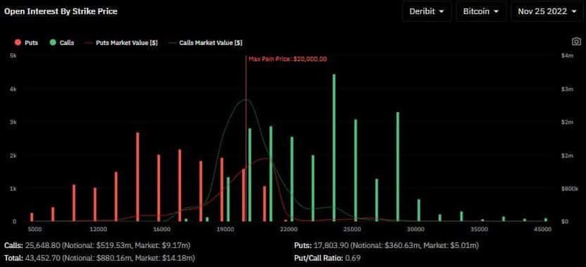
I’m especially fond of this chart because it also gives me the Max Pain! If reading and interpreting the Max Pain is a topic that interests you, I’d encourage you to revisit my tutorial on the Max Pain, where I’ve already shared my interpretation of that data, along with my tutorial on Open Interest and the Funding.

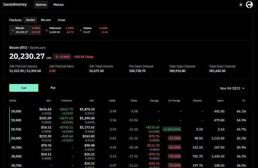
The Raw Numbers on CoinOptionsTrack
When you land on the BasedMoney.io site, you’re taken straight to a table of numbers that should speak to you if you know options trading.
The CoinOptionsTrack Charts (Metrics)
Now let’s get down to business with the charts that will let us read the information we care about most!
- Open Interest by expiration date
- Open Interest by strike price + Max Pain Price
- Total Open Interest Volume across Put and Call options
- Trading Volume by expiration
- Trading Volume by strike
- Taker Volume compared to the index price (new)
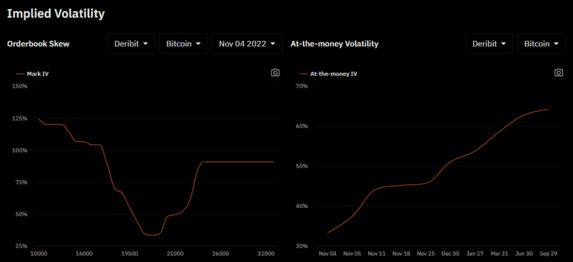
- 2 charts on implied volatility: Mark and At the money
- Graphical representation of 4 Greeks: Delta, Gamma, Theta, Vega
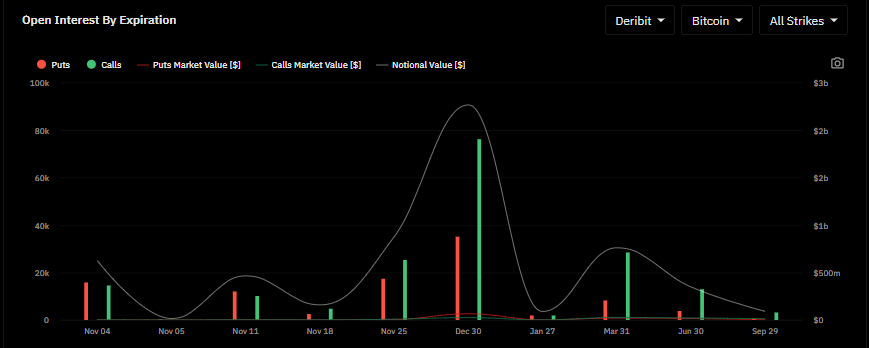
Open Interest by expiration date
This is the amount of options contracts held in active positions, sorted by expiration date.
Open Interest against the exercise price — the strike price
As I mentioned earlier, in my view this is the most useful chart on BasedMoney, and that’s borne out by the fact that it’s apparently the most popular one according to BasedMoney.
I touch on it a little above, but I mostly cover it in my various tutorials devoted to the Max Pain, Open Interest and the Funding. On top of the chart, you also get a clear ratio of OI between Puts and Call Options so you can see the proportion of each at a glance.
As a reminder, the Max Pain price is in fact the exercise price (strike) at which a majority of options expire worthless.
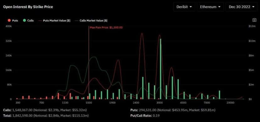
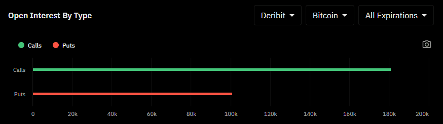
Total Open Interest Volume across Put and Call options
This chart lets you see at a glance whether it’s the put or the call options that dominate the market.
On the other hand, it doesn’t tell us whether these are sales or purchases of calls.
In the tab at the top right, you can select “all expirations” or pick the specific expiration date you’re interested in.
In the chart below, you can clearly see that the calls are predominant.
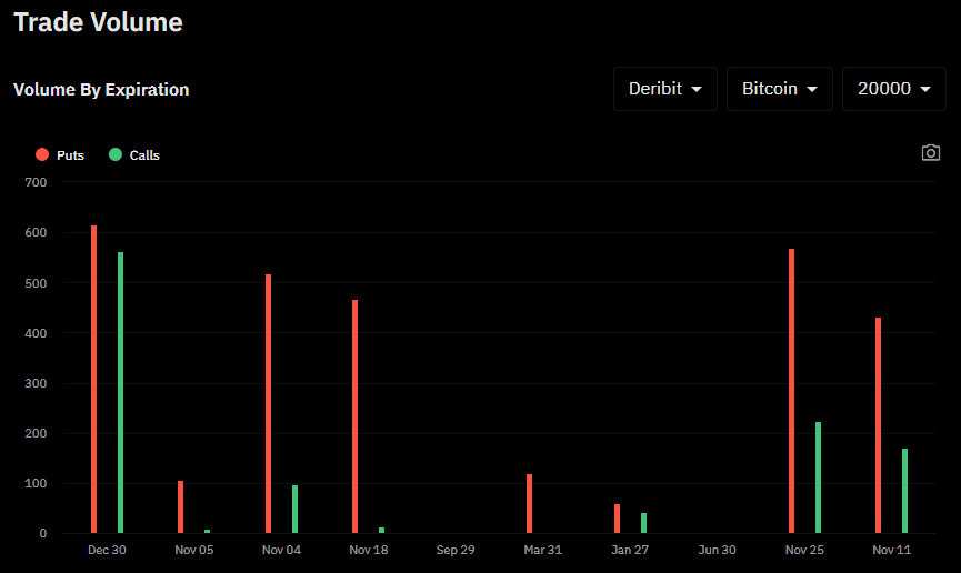
Trading Volume by expiration
On this chart you can read which expiration dates carry the highest volumes!
If you find high-volume contracts, I’d recommend reading the Max Pain and then keeping an eye on the Open Interest.
What’s really interesting in this example is that we see large volumes on more exotic expirations like November 11 or the 4th. (at the time of writing it’s November 3)
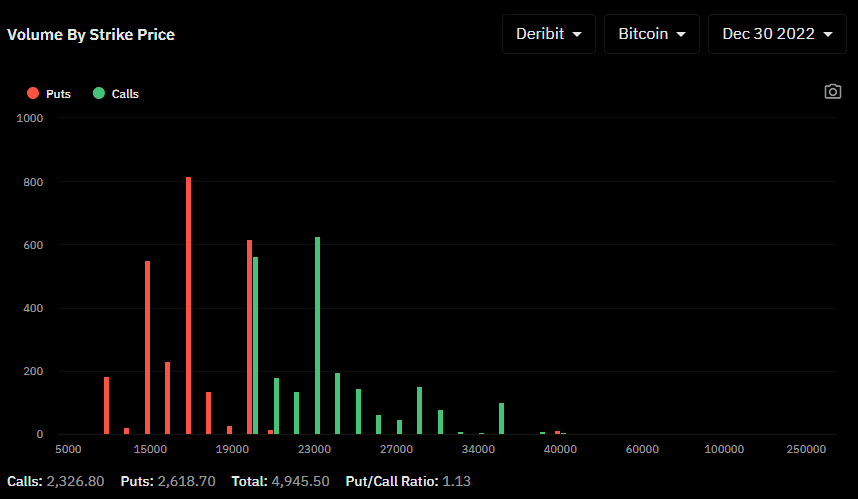
Trading Volume by Strike Price
This chart lets us quickly understand which strike prices are the most traded.
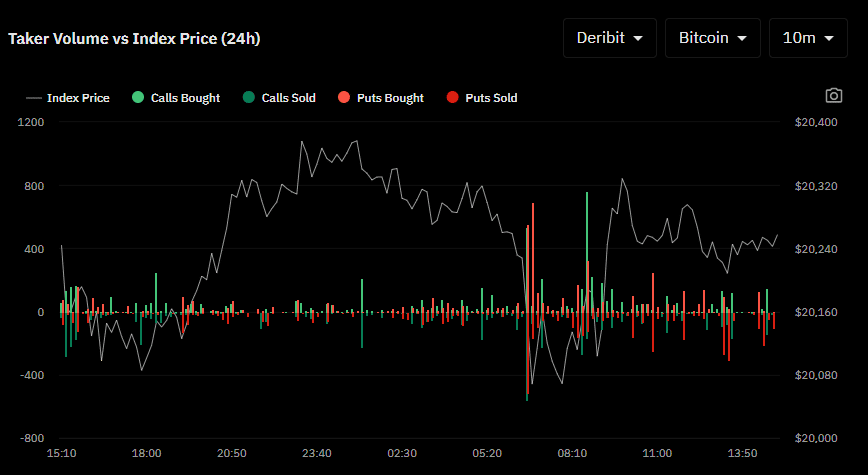
Taker Trading Volume against the index price
The taker volume (fees) represents transactions that are executed immediately, which often signals a sense of urgency.
Implied Volatility
The 1st chart shows the difference in implied volatility between out of the money options, “at the money” options and in the money options.
The 2nd chart shows the difference in implied volatility of the at the money strike prices across all expiration dates.
The Option Greek Tables
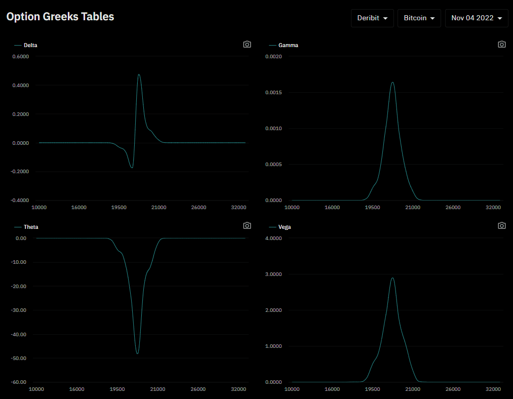
You may have noticed that I haven’t yet explained everything among the charts on offer on CoinOptionsTrack/BasedMoney. So I’d encourage you to swing back by this page in the near future, because it’s coming soon!
In the meantime, I’d recommend taking another look around our blog so you don’t miss my latest tutorials on trading, investing, mindset, techniques, tools, and more.
Every guide here is free. Browse the full course and join a community of traders who share ideas every day.