When it comes to technical analysis, one of the first things a beginner trader learns is that markets move by reproducing recurring figures, or patterns. These are what we call pattern trading, or rather trading patterns. So there’s no doubt about it, know that I draw all my patterns on TradingView.
By the way, if you’re still a beginner and you haven’t yet watched my courses on Japanese candlesticks, I’d first encourage you to go back through each one in my free trading course on YouTube.
Japanese Candlestick Course and Interpretation

At first, learning trading patterns haunts us, because plenty of bloggers and influencers claim on social media that spotting them can dramatically boost your profits.
However, as you’ve no doubt learned the hard way: the ones handing out advice aren’t the ones footing the bill!!!
Don’t lose your way: in my trading school, I put Price Action analysis first, above everything else. That said, recognizing certain patterns can help me confirm my initial PA read.
The problem is that there’s a huge number of patterns out there. So we have to sort through them.
In this free trading course, I’ll start by introducing you to chart-based pattern trading.
8 Trading Patterns to Know
Here’s how I see pattern trading: I only use a chart-based trading pattern if it confirms my Price Action analysis — in confluence with other signals and clues.
I’ll start with all the patterns I don’t really use, except as a visual illustration:
1. The Trading Patterns that are weak according to my method
Then we’ll look at some interesting patterns, because they work well once they’re validated:
To use these patterns effectively, you first have to learn to read market structure and market dynamics. Understanding how the market moves makes it easier to picture these patterns when they appear. On their own, they can’t give you a sense of the price action trend. So they must always be considered alongside other clues or signals.
The Setups That Lack Effectiveness
I. Triangles
A. The Ascending Triangle
Definition of an Ascending Triangle
The ascending triangle belongs to the triangle family of trading patterns. This pattern is a technical figure that shows traders a bullish accumulation where the lows get higher and the highs stay equal.
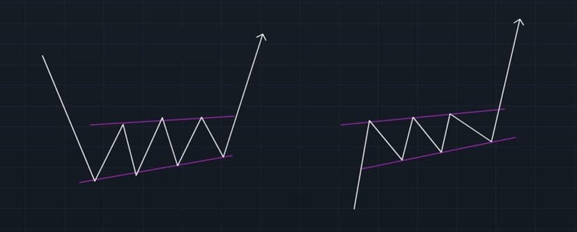
This trading pattern can form within the continuation of a bullish trend or as a reversal pattern of a bearish trend. What matters is that the last part of the move is to the upside. Most of the time it’s a continuation pattern — depending on where it forms relative to the structure.
You can connect the two pattern lines to form the triangle as shown below, but that isn’t always possible. Even so, these two lines will usually be very close together.
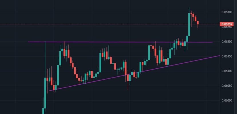
The ascending triangle pattern is used as a tool to confirm that the uptrend will continue. It’s used for a trade idea based on breaking through a resistance (breakout) or a trade idea based on breaking through a support (retracement or pullback). You have two options for taking this trade: you either wait for the break of the equal high, or you wait for the level to break and for the pullback onto the broken high to enter long.
B. The Descending Triangle
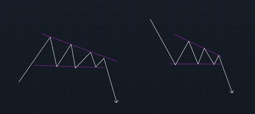
Descending Triangle: Definition
When you look at a descending triangle, you’ll notice the candles printing wicks on the downside. This shows that the strength is on the short side. You’ll usually see them over a one-to-three-month window. That said, as a day trader, you can still spot triangles forming like in the image above, where the pattern plays out in a matter of minutes.
The descending triangle belongs to the triangle family of trading patterns. This pattern is a technical figure that shows traders a bearish accumulation where lower highs print and the lows stay equal.
This pattern can form within the continuation of a bearish trend or as a reversal pattern of a bullish trend. What matters is that the last part of the move is to the downside. Most of the time it’s a continuation pattern — depending on where it forms relative to the structure.
The descending triangle pattern is used as a tool to confirm that the bearish trend will continue. It’s used for a breakout trade idea or a pullback trade idea. To trade it, you either enter on the break of the equal low, or you wait for that level to break and pull back onto the broken low to take the short position.
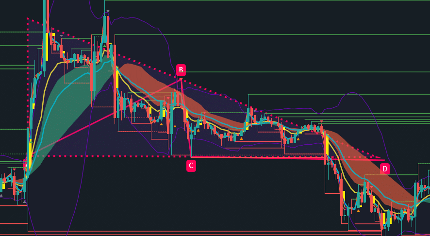
For this pattern, you can see the candles printing lots of wicks on the downside, which shows that the strength is on the short side. You’ll usually see them over a one-to-three-month window. That said, as a day trader, you can still spot triangles forming like in the image above, where the pattern plays out in a matter of minutes.
There are also chart patterns called wedges that seem interchangeable with triangles. So it can be easy to confuse the two.
II. Wedges
Wedge Pattern: Definition
A wedge-type trading pattern forms when an asset’s price movements tighten between two sloping trendlines. There are two types of wedge: rising and falling.
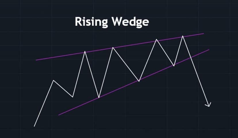
The Rising Wedge
A rising wedge is shown by a trendline caught between two support and resistance lines that both slope upward. In this case, the support line is steeper than the resistance line. This pattern generally signals that an asset’s price has a high probability of triggering a bearish move, which happens when it breaks through the support level.
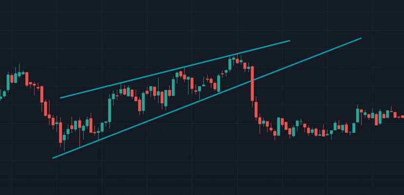
The Falling Wedge
A falling wedge forms between two levels that both slope downward. In this case, the resistance line is steeper than the support. A falling wedge generally signals that an asset’s price will rise and break through the resistance level, as shown in the example below.
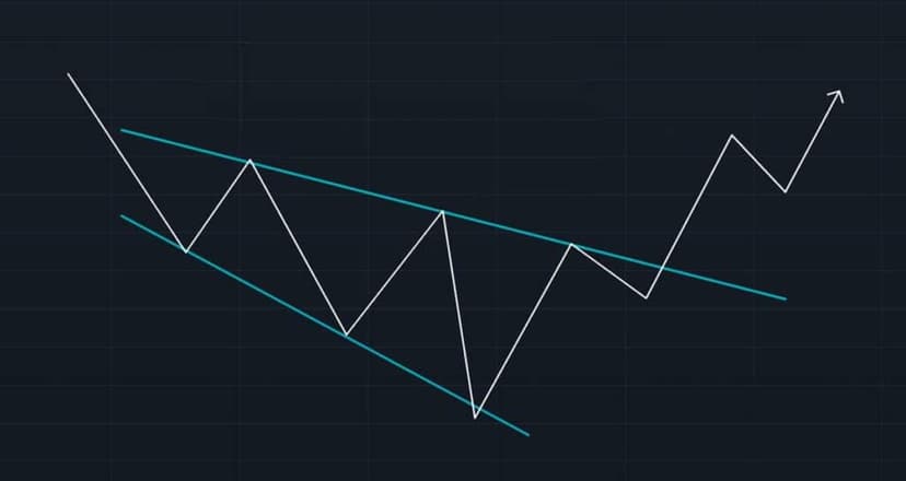
Rising and falling wedges are both reversal patterns, with rising wedges representing a bearish market and falling wedges being more typical of a bullish market.
Now let’s move on to the patterns I use the most to confirm my Price Action analysis. These are the Double Top, the Double Bottom, the Head and Shoulders, and finally, the Cup and Handle.
Trading Patterns: The Effective Setups
I. Trading Patterns: Bear and Bull Flags
Bear and Bull Flags are ranges tilted upward and downward respectively, as you can see in the theoretical examples below. Generally, they break in the opposite direction!
Bear Flag
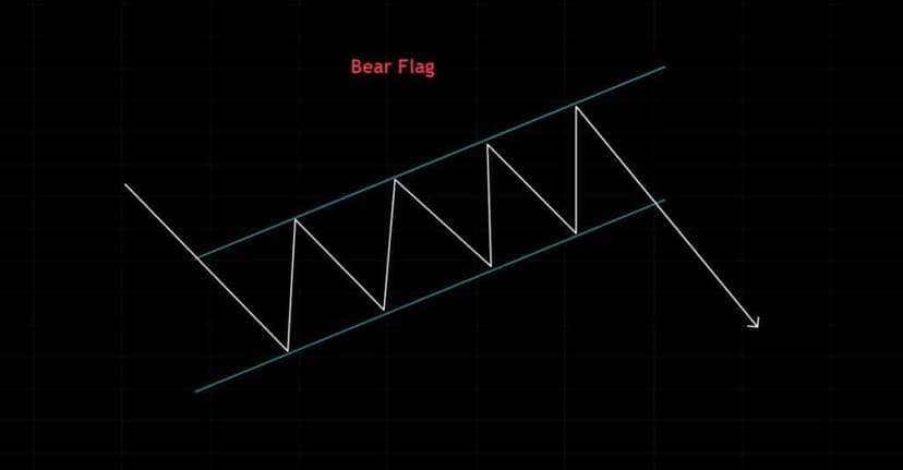
Bull Flag
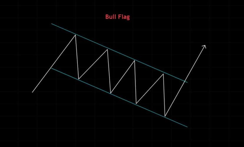
To better understand these patterns, which are particularly useful, I invite you to refer to my free course on Price Action!
II. Double Pattern Trading: Top and Bottom
Double Top Pattern
Double Top Trading Pattern: Definition
The Double Top Trading Pattern is a very common chart pattern. It looks like an “M” when you draw it on a chart. It’s used to identify a rejection at a key level for a continued push down from a prior resistance. In Day Trading, the double top can play out in a few minutes or take a bit longer depending on the timeframe you’re using.
The double top is made up of 2 consecutive rejection patterns in the shape of a v-top. They can also be rounded tops that don’t instantly reject a key resistance level. They often occur at the end of a prolonged bullish cycle and reveal a key selling zone where sellers step into the market aggressively. The second top forms when the sellers from the first top come to reject the price once more.

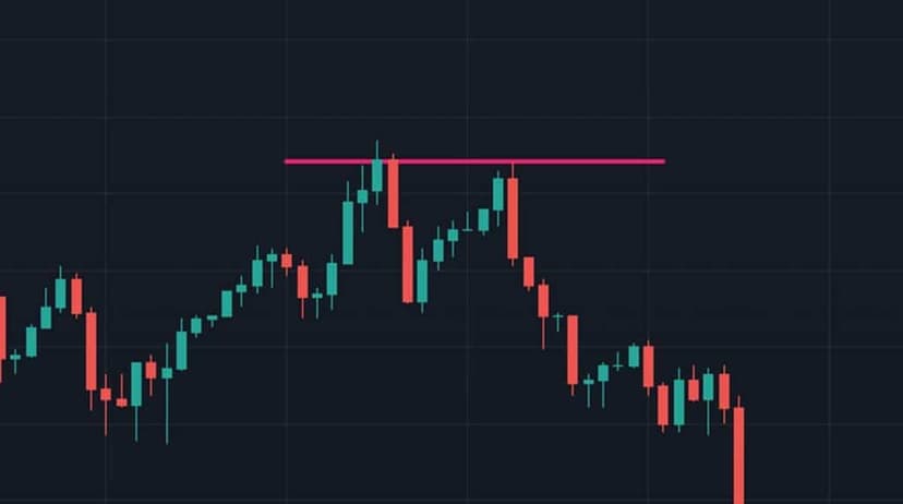
Here’s an example of a double top that opens up two ways to position ourselves in the market.
The big rejection at the first red circle is almost impossible to trade, but it still gives us very important information: potentially, on the second test of this level, we’ll see another rejection.
Bold traders can try to place a sell limit order to enter where the red line is, and a Stop Loss around the blue line above. This pattern is read as a possible bearish reversal of a broader trend. It can also express a bearish continuation on a slight pullback that creates the double top. The double top is created by a large number of sellers entering the market at a given moment to halt the long wave of buying that has built up to that top.
The second way to trade this double top is to wait for the break and the retest of the bottom of the double top (the lower line). You have to wait for that structure to break and look to place a short on the retest at the yellow circle. That’s really one of the basics of my method! As you probably already know, I almost never trade the breakout or breakdown.
Double Bottom Trading Pattern
Definition of the “Double Bottom” Pattern
The Double Bottom Trading Pattern is also a very common chart pattern. It’s the counterpart and opposite of the double top, resembling a “W” on a chart. It’s used to identify a rejection at a key level for a continued push up from the prior resistance. When you’re day trading, the double bottom can play out in a few minutes or take a bit longer depending on the Timeframes you use.
The Double Bottom is made up of two consecutive V-shaped rejection patterns. They can also be rounded bottoms that don’t instantly reject a key support level. They often occur at the end of a long decline and reveal a key buying zone where buyers step into the market aggressively. The second bottom forms when the buyers from the first bottom come to reject the price once more.
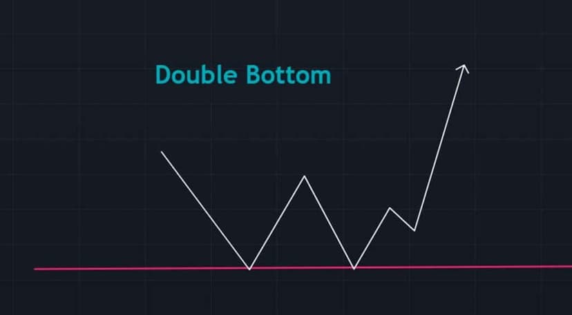
Here’s an example of a double bottom where there are two potential ways to play this market. The big rejection at the first red circle is almost impossible to trade, but what it does is give you a very important piece of information: potentially, on the second test of this level, we’ll see another rejection.
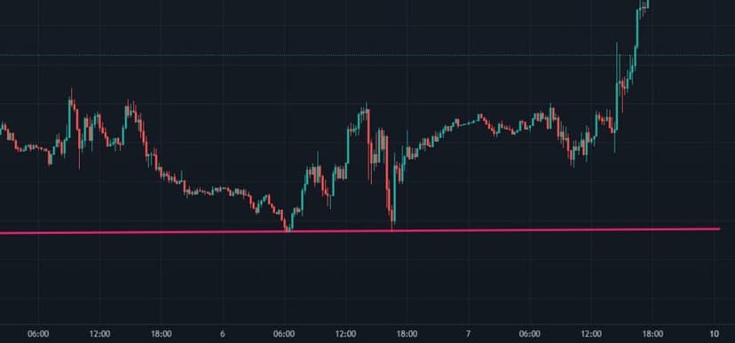
Bold traders can try to place a buy limit order to enter where the red line is, and a stop-loss below the red line in anticipation of the second red circle forming. This pattern is generally a bullish reversal of a larger bearish trend or a bullish continuation on a slight pullback that creates the double bottom. The double bottom is created by a large number of buyers entering the market at a given moment to halt the wave of short selling that has built up down to that bottom (floor).
The second way to use a double bottom setup is to enter at the break and wait for the retest of the top of the double bottom, which is the white line. You wait for that structure to break. Then you look to go long on the retest.
III. Head and Shoulders Trading Pattern
Definition of the Head and Shoulders Trading Pattern (head up)
The Head and Shoulders Trading Pattern is one of the most common — you see it thrown around everywhere.
Beginner traders easily recognize this setup. It’s a conveniently satisfying figure when you’re starting out — but beware of over-read interpretations… The formation on the chart of three peaks and a “neckline” is what lets you spot the Head and Shoulders.
The middle peak is the highest and forms the head, while the two side peaks are slightly shorter and form the shoulders, which aren’t always of equal height. The pattern is meant to anticipate a bullish or bearish reversal, depending on the orientation of the head. It’s a fairly reliable pattern that signals a trend reversal. It’s one of the most reliable trend-reversal patterns out there.
The pattern identifies a slowdown in market dynamics, whether it’s an uptrend or a downtrend. The highest peak, or head, is a new high or low that indicates the structure of this move will continue as long as the momentum at the neckline holds. When the third peak, or second shoulder, forms, you can notice that it is either lower (bullish move) or higher (bearish move) than the head. This lets you identify a loss of momentum based on simple market-structure principles. The break of the neckline is the best place to position yourself and lock in the best profit.
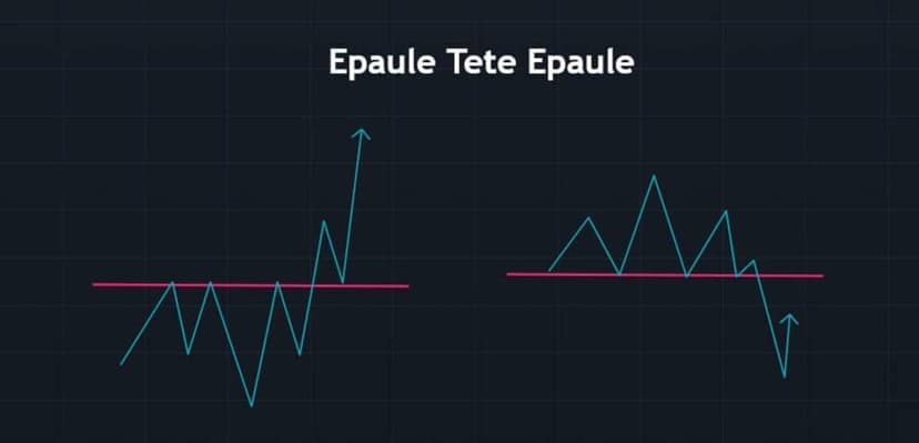
The Head and Shoulders Trading Pattern, or simply Head and Shoulders (Head and Shoulders), often doesn’t produce a good read. So you should be wary of it. Information is never perfect and can look shaky, as in the example below. We have the head and shoulders in blue and the neckline in red. When we get the break of the yellow line, we continue higher and even try to retest the break for another opportunity to the upside.
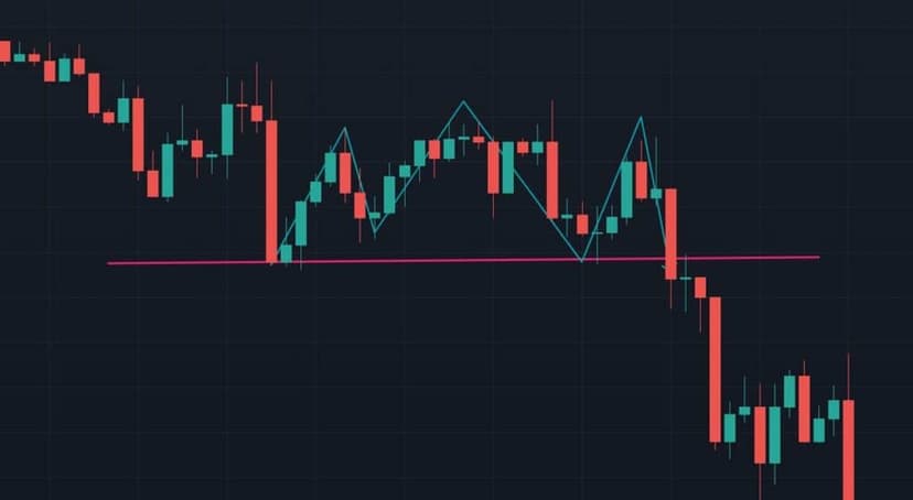
The Head and Shoulders pattern (head up) is a bearish reversal pattern.
When the same setup occurs upside down, with the head pointing down, then we’re dealing with a bullish reversal. The key is to understand that both cases can occur: the idea is then to take advantage of the break of the “neckline” while paying attention to the direction of the figure — in other words, whether the head points up or down.
IV. Cup and Handle Trading Pattern
Cup and Handle Trading Pattern: Definition
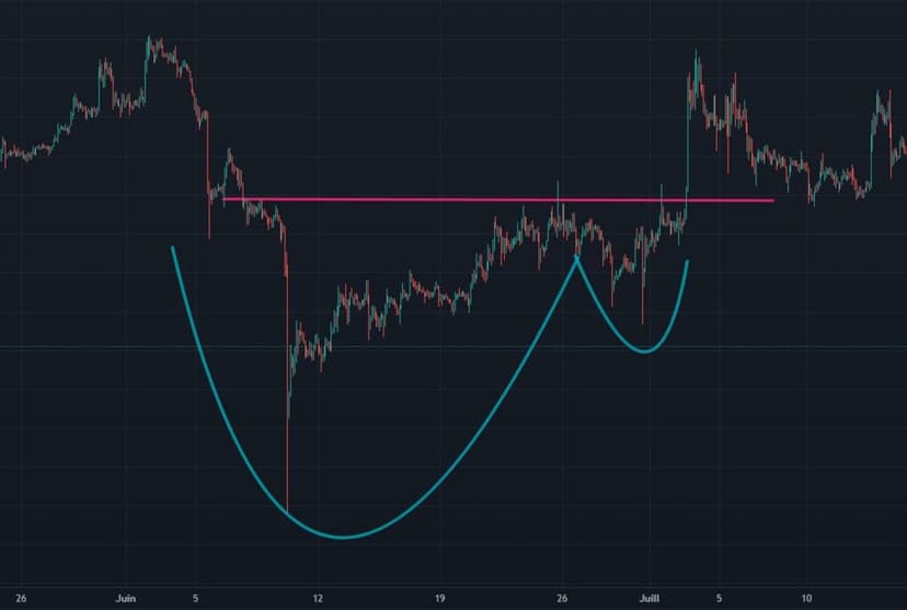
The last pattern to know as a trader is the cup-and-handle chart pattern. It gets its name from its resemblance to a coffee cup. This pattern is shaped like a “U”, and the handle drifts slightly downward. There’s also an inverted cup and handle.
The normal (upright) cup and handle is considered a bullish continuation pattern on a pullback formed by the handle. The inverse is a bearish continuation candle.
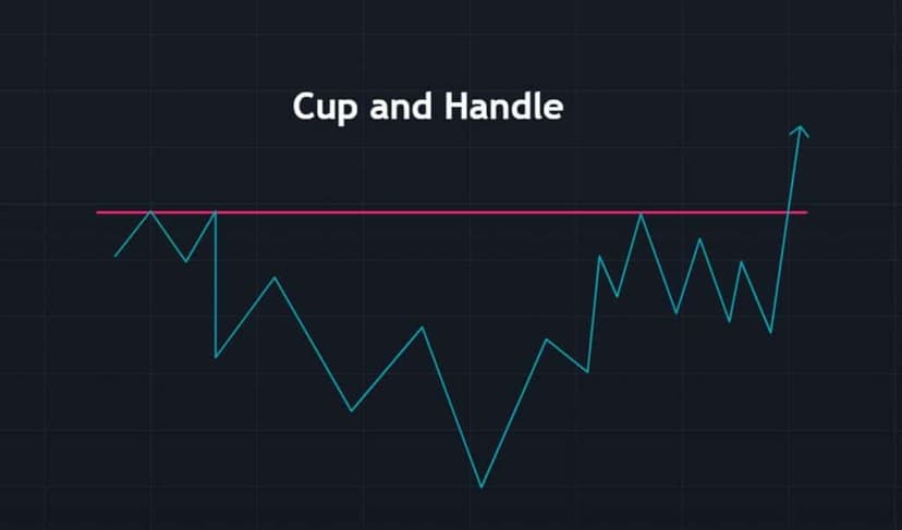
The most effective way to use the Cup and Handle trading pattern is to watch the end of the cup portion forming on an upward slope and wait for the handle’s pullback to form so you can grab the long and ride the next bullish wave.
If you’re looking to trade the “cup and handle” pattern, several options are available for entering a position.
Option 1: try to anticipate where the pullback will end. If market structure and order flow confirm it, you can go long.
Option 2: look for a breakout of the top of the handle and of the market. Traders often place their stop-loss below the bottom of the handle and target the length of the cup between the bottom and the breakout point. If the distance between the bottom and the breakout point of the cup and handle is, for example, 20 points, that can be the profit target.
Pattern Trading and Japanese Candlesticks
When you first get interested in trading, it’s important to master the basics. Here, we’re going to explore the concept of Japanese candles, also known as “candlesticks”.
Japanese candlesticks are the most popular and most widely used charting tool. They provide essential information such as the open and close prices, as well as the highs and lows over the chosen timeframe.
Candlesticks hold an important place in technical analysis and absolutely must be factored into your trading plan. They help you understand the market’s mindset and spot the key zones where buyers and sellers are active. Personally, candlesticks are indispensable to my price action reading.
Anatomy of a Candlestick Chart
Here’s what a candlestick chart looks like:
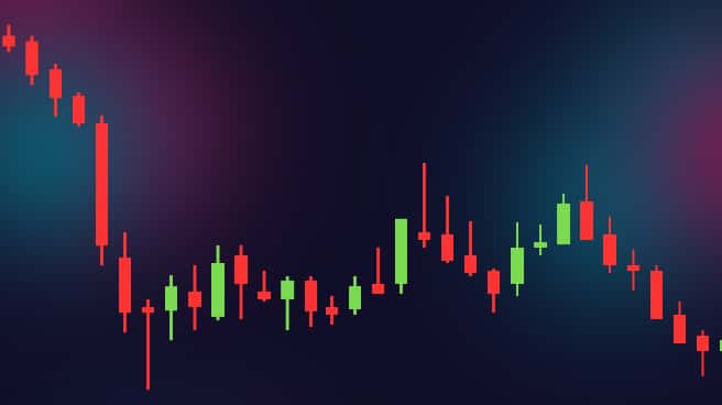
As you can see, several horizontal bars, or candles, make up this chart. Each candle is made up of three parts:
- The body
- The upper shadow
- The lower shadow
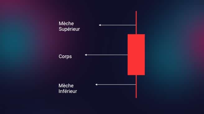
The body is also colored red or green. Each candle represents one timeframe, and the data corresponds to the trades executed during that period.
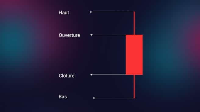
A candle contains four data points:
Open – the first trade made during the period the candle covers
High – the highest price traded
Low – the lowest price traded
Close – the last trade during the period the candle covers.
How to Analyze a Candlestick Chart
The candle body represents the open and close prices of the trades made over the chosen timeframe. This visualization lets you quickly assess the asset’s price range for that particular period.
On top of that, the color of the candle body gives clues about the direction of the asset’s price, signaling either a rise or a fall.
Above and below the candle body are vertical lines called wicks or shadows, which mark the lowest and highest points of the stock’s price
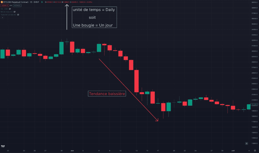
For example, in a candlestick chart covering one month, where each candle represents a day, a series of red candles indicates a downtrend in the stock’s price.
For a better understanding, I’ve put together a quick tutorial — under 15 minutes to grasp how candlesticks work
Candlestick Charts
Japanese candlesticks are an essential element for grasping the state of the market and understanding Price Action, such as moves to the upside and the downside.
Keep in mind that, even though a single candle can provide important information, each candle must be analyzed while taking into account the ones before it and the ones after it.
For a better understanding, we’re going to split the setups into two sections:
- Bullish patterns
- Bearish patterns
Japanese Candlesticks: Bullish Trading Patterns
The Hammer Pattern
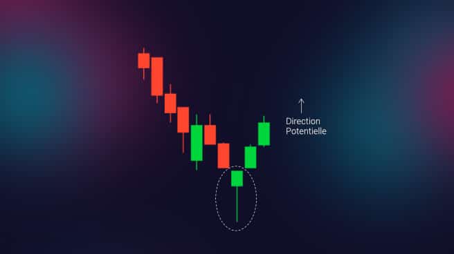
This is a candle with a short body and a long lower wick. It’s usually found at the bottom of a downtrend. It shows that, despite selling pressure, a strong buying push drove prices higher. If the body is green, it points to a stronger bullish market than a red body would.
The Inverted Hammer Pattern
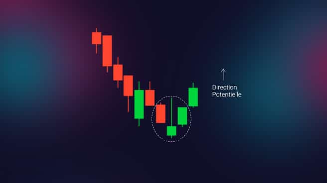
This is a candle with a short body and a long upper wick. It’s usually located at the bottom of a downtrend. It signals buying pressure followed by selling pressure. It also indicates that buyers will soon take control.
The Bullish Engulfing Pattern
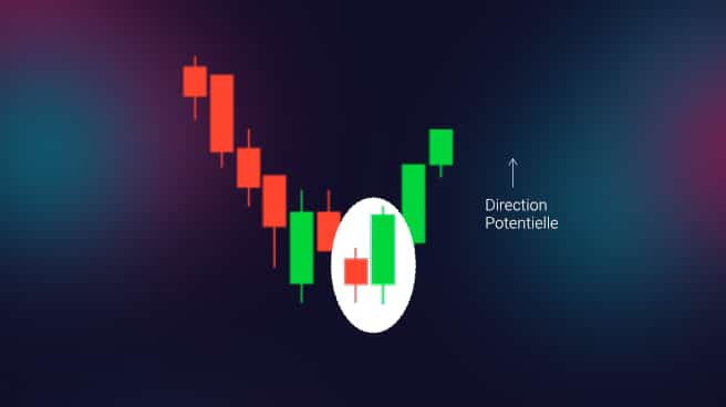
This is a two-candle figure in which the first candle is a short red candle engulfed by a large green candle. It signals a bullish market pushing the price higher despite a weaker open than the previous day.
The Piercing Line Pattern
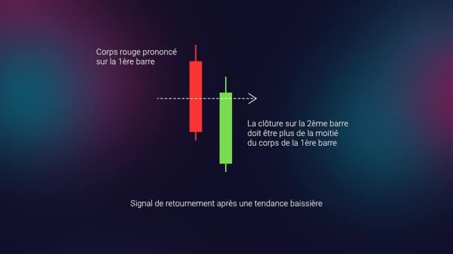
This is a two-candle figure made up of a long red candle followed by a long green candle. In addition, the close of the second candle must be above the midpoint of the first candle’s body. This signals strong buying pressure.
The Morning Star Pattern
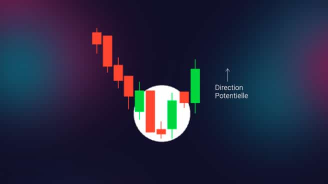
This is a three-candle figure that features a candle with a short body between a long red candle and a long green candle. There’s usually no overlap between the short candles and the long candles. It’s a sign that selling pressure is easing and that a bullish market is beginning.
Japanese Candlesticks: Bearish Trading Patterns
The Hanging Man Pattern
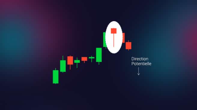
This is a candle with a short body and a long lower wick. It’s usually found at the top of an uptrend. It signals that selling pressure has been stronger than buying pressure. It also indicates that the bears are taking control of the market.
Trading Pattern: The Shooting Star Pattern
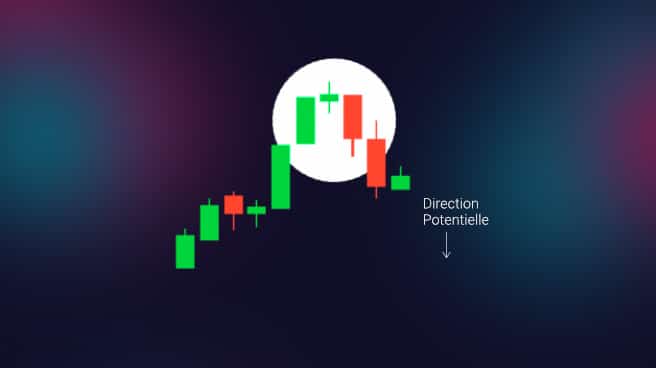
This is a candle with a short body and a long upper wick. It’s usually located at the top of an uptrend. Typically, the market opens higher than the previous day and rises a little before collapsing like a shooting star. This signals that selling pressure is taking over the market.
Trading Pattern: The Bearish Engulfing Pattern
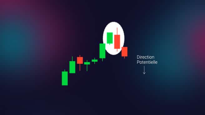
In candlestick chart analysis, this is a two-candle figure in which the first candle is a short green candle engulfed by a large red candle. It usually occurs at the top of an uptrend. It signals a slowdown in the market’s rise and a bearish trend to come. If the red candle is lower, the bearish trend is generally more significant.
Trading Pattern: The Evening Star Pattern
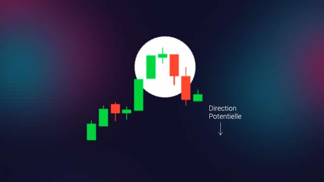
This is a three-candle setup that features a candle with a short body between a long red candle and a long green candle. There’s usually no overlap between the short candles and the long candles. It’s the sign of a potential reversal from a bullish trend to a bearish trend. Note that this signal is all the more significant if the third candle exceeds the gains of the first candle.
The Three Black Crows Pattern
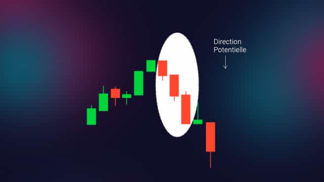
This is a three-candle figure made up of three consecutive red candles with short wicks. These candles open and close lower than the previous day. After an uptrend, it’s a strong indication of a bearish market to come.
I know this can feel a bit scattered if you’ve only just started trading. That’s why I’ve summed up all these figures in an explainer video

My Conclusion on Pattern Trading
There you have it — we’ve covered the main patterns. The ones I use the most remain the double tops and double bottoms, as well as the Head and Shoulders, because they’re the ones that best help me picture a price move. In reality, these patterns are just labels we stick on price moves that occur often and that help us anticipate them better.
My advice about patterns: when you manage to spot one, you must always keep an eye on your technical analysis as well as on the price action, because these figures are far from infallible. Only combining several confluent signals lets you achieve profitable results.
It’s important to note that these figures have no bearing on the direction of the trend. They can only be used to confirm a trend or to add a signal to a trend.
The big weakness of these figures is that they often aren’t confirmed by other indicators, in particular by the Price Action. So you should NEVER use them on their own. They only serve to improve the reliability of our assumptions about the next move the asset is likely to make.
If you’re interested in chart patterns, I also recommend my free trading course on Elliott Waves. That said, I strongly recommend starting with Wyckoff and Price Action! For more free trading courses, head to my free trading course section!
Want the full picture on this wave-counting approach? Check out my complete guide to Elliott Wave Theory for a deeper look at impulse and corrective waves.
Every guide here is free. Browse the full course and join a community of traders who share ideas every day.