Velo Data — velo.xyz — bills itself as “the leading crypto market interface.” Behind the slogan sits a very concrete promise: bring onto a single screen what derivatives traders would normally have to hunt down across five different sites — Open Interest, funding, CVD, liquidations, options implied volatility, ETF flows, and real-time market news.
At Captain Trading, you’ve already run into its name: it’s one of the three tools we cite for displaying the CVD, alongside Coinalyze and Market Monkey. This guide covers the whole platform, screen by screen: what each module shows, how to read it, what the pricing is actually worth — and the 5-step routine for turning that entire data stream into a market read that actually holds up.
The essentials:
- Velo Data aggregates derivatives data from Binance, Bybit, OKX, Deribit, and Hyperliquid — plus the CME on the TradFi side — at 1-minute resolution, across roughly 3,700 products.
- Most of it is free to browse, without even creating an account: the Futures, Options, Market, and TradFi dashboards, plus the charting terminal.
- Its flagship screens: Open Interest and funding by exchange, CVD in dollars, liquidations, annualized basis, and seasonality by hour and by session.
- The News feed timestamps every announcement and plots it on the chart with its price impact — delayed by 5 seconds on the free tier, instant on the paid one.
- It’s not a trading platform: you read the market here, you place no orders here. And none of these curves replaces a trading plan.
What exactly is Velo Data?
Velo is a crypto market data platform, specialized in futures and perpetual contracts — where the bulk of crypto volume actually trades. Its job: collect raw data from the major derivatives venues, harmonize it, then hand it back in four forms — a charting terminal, themed dashboards, a news feed, and an API. The scale sets the stage: roughly 3,700 unique products, 2,000 tradable markets, and more than 3 billion minutes of historical data.
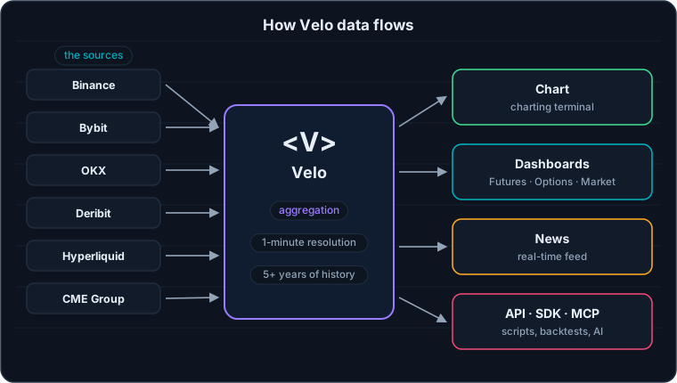
Five crypto derivatives venues plus the CME on one side; charts, dashboards, news, and an API on the other.
The list of sources already says a lot: Binance, Bybit, OKX, Deribit, and Hyperliquid cover the overwhelming majority of derivatives activity — legacy CEXs and on-chain perps alike. Velo doesn’t cook up some exotic indicator: it cleanly adds up what each venue sees go through, and it’s precisely that aggregation that makes the read honest. An Open Interest spike on a single exchange can be an artifact; the same spike across five venues at once is information.
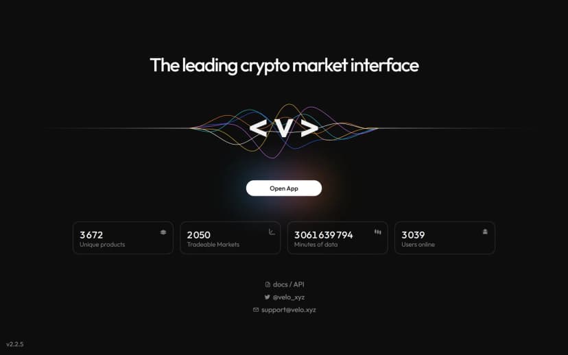
The velo.xyz homepage sets the tone right away: data, nothing but data.
Getting started: 30 seconds, stopwatch in hand
One click on “Open App” and you land straight on the BTC Futures dashboard — no sign-up, no card, no questionnaire. The nav bar sums up the whole architecture: Chart (the charting terminal), News (the real-time feed), Futures (the per-asset dashboard), Options, Market (the market-wide overview), and TradFi (the bridge to the CME and ETFs). A search field lets you jump from BTC to any of the roughly 3,700 products, and every chart exports in one click — as a PNG image or raw data.
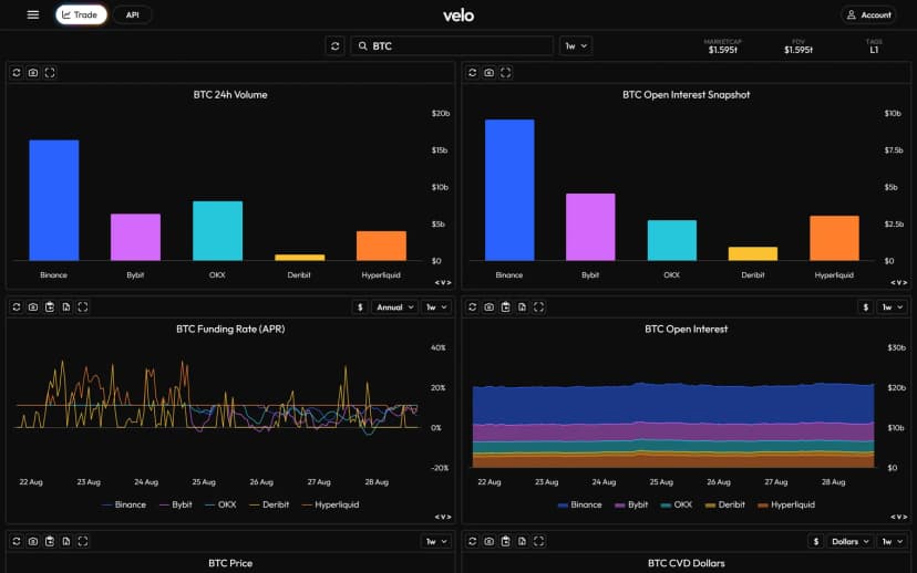
The BTC Futures dashboard: 24 h volume and Open Interest by exchange, funding, market cap — the state of the market on one screen.
Every tile on the dashboard follows the same grammar: a title, an adjustable period (1 day to several years), and a breakdown by exchange with a consistent color code — Binance in blue, Bybit in purple, OKX in teal, Deribit in yellow, Hyperliquid in orange. Once that legend is in your head, you can read any Velo screen in one second.
The Futures dashboard, metric by metric
This is the heart of the platform, and every tile maps to a concept we teach elsewhere on the site. Let’s walk through them in the order a trained eye reads them.
Open Interest: where is the money positioned?
Open Interest — the total of open contracts — is the first question to ask any derivatives market: is there money committed, and where? Velo answers it twice. The snapshot compares venues against each other: who’s carrying the positions right now?
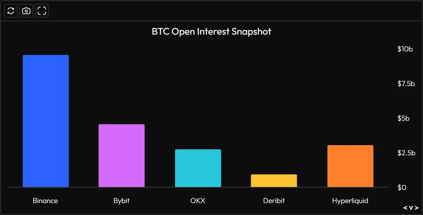
Who’s carrying the positions? In the screenshot, Binance dominates BTC’s OI, ahead of Bybit, Hyperliquid, and OKX.
The history then stacks those same venues over time. That’s what gives you the context: total OI swelling while price climbs tells a story of a trend funded by fresh money; OI melting away on the same move tells a story of shorts simply unwinding. The level alone says nothing — it’s the change cross-referenced with price that talks.
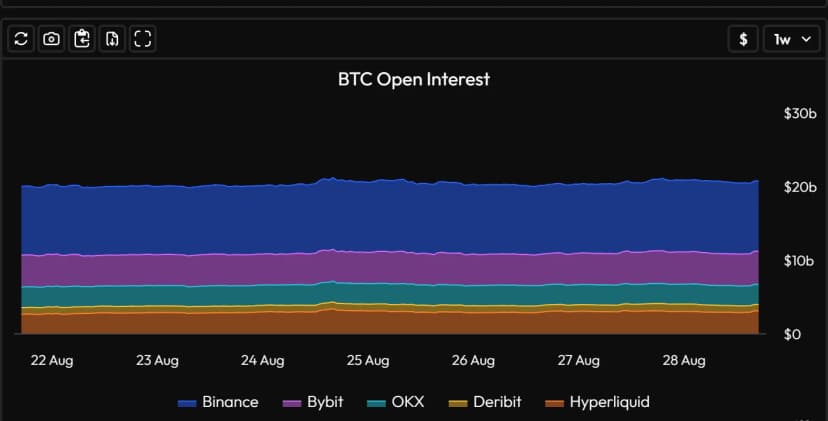
OI stacked by exchange: around $20 billion in open positions on BTC alone.
Funding: who pays to hold their position?
The funding rate is the rent on perpetual contracts: positive, longs pay shorts; negative, the reverse. Velo displays it annualized (APR) — an excellent choice, because an abstract “0.01% per 8 hours” becomes a very tangible “11% a year.” Overlaying the exchanges also reveals venue-specific divergences: when a single platform runs hot on its own, that’s usually its local leverage talking, not the market.
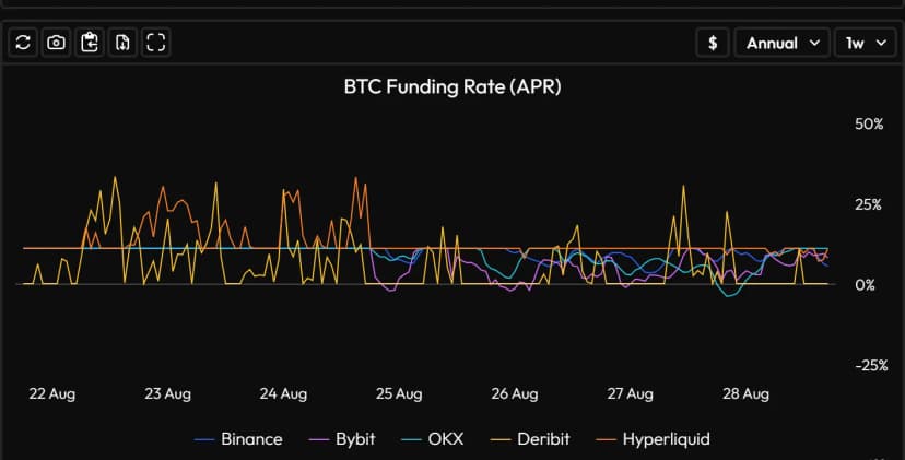
In the screenshot, Hyperliquid and Deribit spike above 25 % APR before falling back in line: local excess leverage reads in one second.
CVD in dollars: who’s driving it?
The CVD — Cumulative Volume Delta — accumulates the difference between market buys and market sells: it shows who’s driving the tape, buyers or sellers. You already know the problem: it doesn’t exist on TradingView. That single screen is exactly why Velo makes our trio of order flow tools. Velo calculates it in dollars (more comparable across assets than in contracts) and breaks it down by exchange — enough to spot a price/CVD divergence or a single exchange absorbing all the pressure.
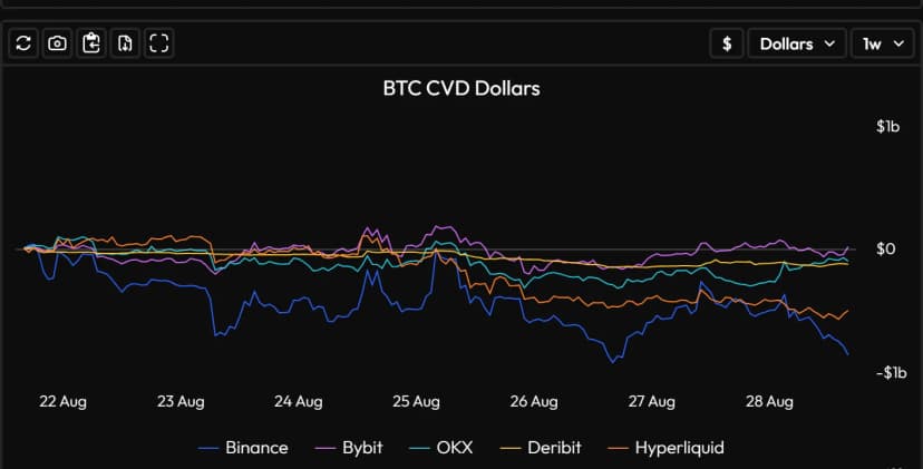
CVD in dollars, exchange by exchange: the net aggression of buyers and sellers — nowhere to be found on TradingView.
Liquidations: who just got wiped out?
Liquidations are the moment leverage returns the money: an under-collateralized position gets force-closed, and its execution feeds the very move that killed it — the well-known snowball effect behind liquidity cascades. Velo plots them above and below zero (longs and shorts liquidated), by exchange. One isolated spike after a wick: housekeeping. Repeated spikes on the same side: an entire positioning capitulating.
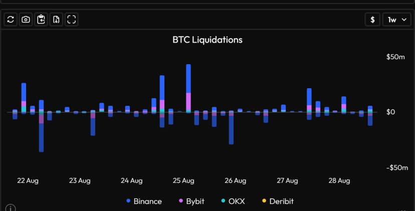
Every spike tells a story of positions getting flushed out — above zero on one side, below on the other, venue by venue.
Annualized basis: the thermometer for long leverage
Basis measures the gap between dated futures prices (3 months here) and spot, annualized. It’s the return on the cash-and-carry trade: buy spot, sell the future, pocket the convergence. A basis widening past 8-10% signals a long-leverage appetite paying a steep price for its exposure; a basis that collapses — or even inverts — accompanies periods of stress. In the screenshot, it’s breathing calmly between 4% and 5.5%: a market that’s neither euphoric nor panicked.
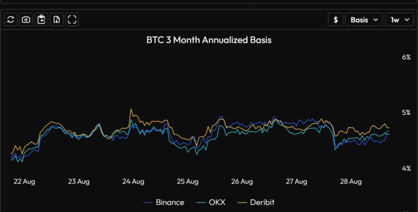
The 3-month annualized basis: what carrying the trade between spot and futures pays — or costs.
Seasonality and sessions: when does the market move?
Two lesser-known tiles, yet formidable ones for anyone who structures their day around killzones. The first averages BTC’s return hour by hour (UTC) over the past month: it shows when the asset actually moved — and when it did nothing at all. The second accumulates performance by session: US, Europe, Asia-Pacific. Who’s making the price this month? The answer shifts regularly, and it’s worth its weight in gold.
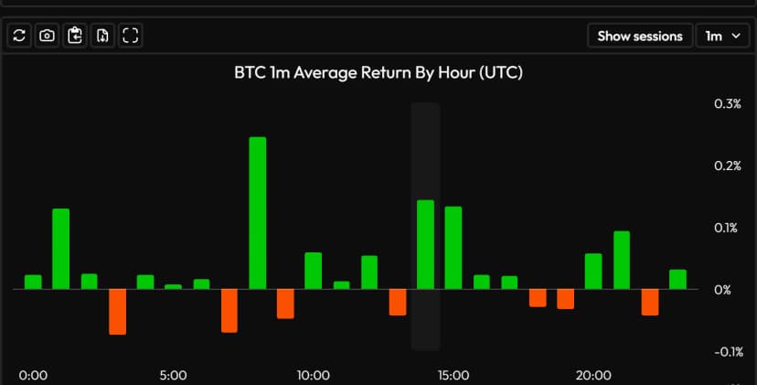
The average return by UTC hour over one month: intraday seasonality, in a single glance.
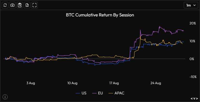
Cumulative return by US / EU / APAC session: who’s really making the price this month?
The Options tab: implied volatility without Bloomberg
This is the module that sets Velo apart most from its direct competitors: a genuine crypto options dashboard — a world dominated by Deribit — readable without an institutional terminal. Three screens are enough to take the market’s pulse:
The term structure of implied volatility (IV) plots, expiry by expiry, the volatility the options market is willing to pay for. Upward-sloping, it says a calm present and an uncertain future; inverted — near term above far term — it says the storm is happening now.
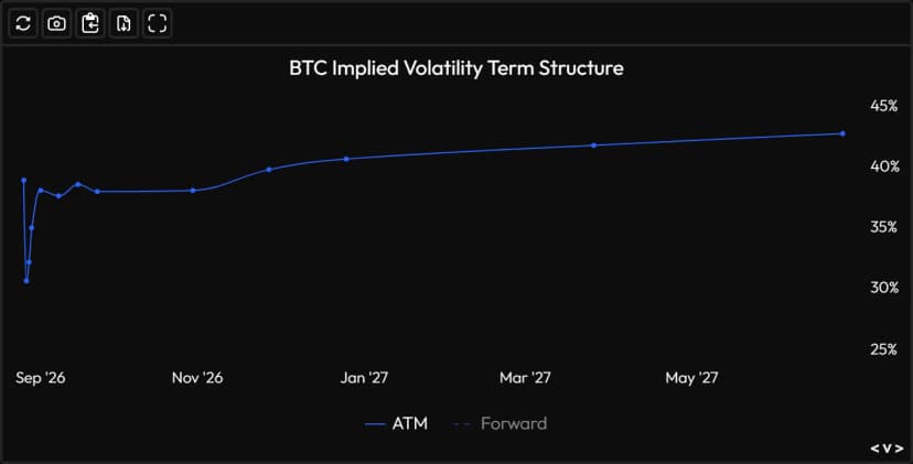
The IV term structure: how much the market is paying for volatility, expiry by expiry.
At-the-money (ATM) IV over a year of history puts the present back into context: a 40% IV doesn’t mean the same thing depending on whether it follows months at 60% or at 25%. And the 25-delta skew compares the price of equidistant calls and puts: when it plunges into negative territory, the market is paying top dollar for downside protection — fear has a curve.
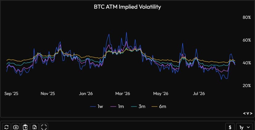
At-the-money IV over one year, by rolling expiry (1 week → 6 months): the context that gives today’s level its meaning.
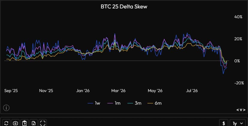
The 25-delta skew: below zero, puts trade more expensive than calls — fear reads right here.
The Market tab: screening the whole market
After the microscope, the wide-angle lens. The Market tab answers the morning question: where is something happening? Its centerpiece is the funding heatmap: large caps in rows, days in columns, and a color for every intensity. Anomalies — an asset stuck bright orange while everything else is seafoam green — jump out before you’ve even read a number.
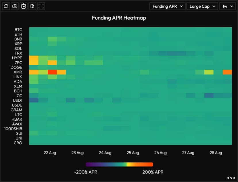
The large-cap funding heatmap: hot spots — here XMR, HYPE, ZEC — stand out before you’ve even read a number.
Around it, performance by sector (DeFi, meme, AI, L1, L2, gaming) shows which narrative is carrying the week, and Open Interest changes among top gainers show where fresh money is flowing in — often the real signal, before price follows.
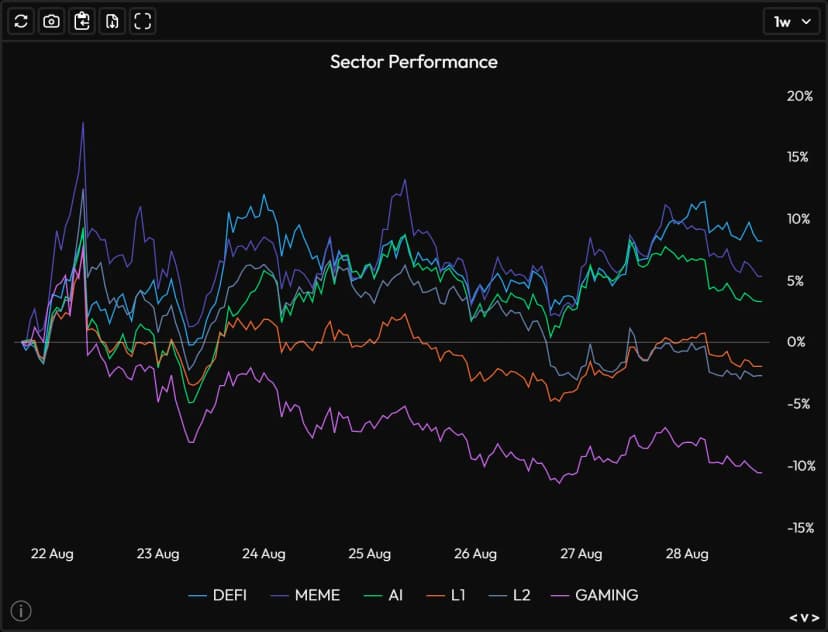
Which narrative is carrying the week? DeFi, meme, AI, L1, L2, gaming — sector rotation in a single curve.
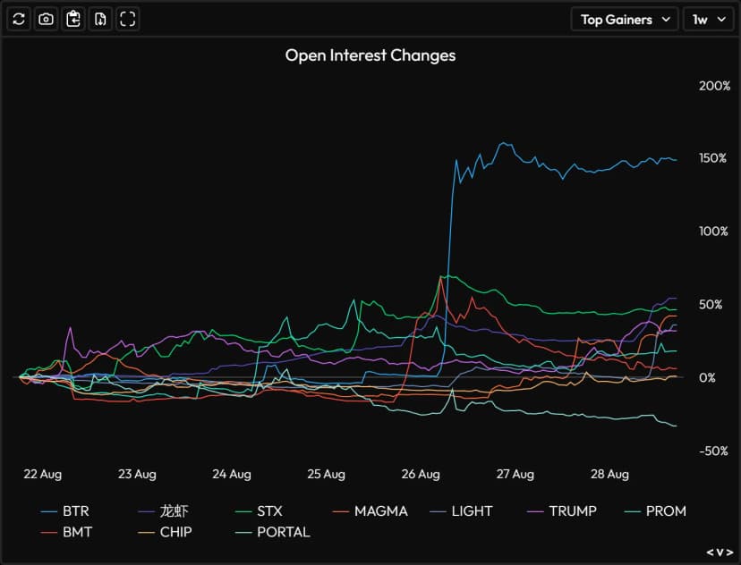
OI changes among top gainers: where fresh money is flowing in — sometimes well before price.
The News tab: the information that moves prices
Velo’s News feed doesn’t look like an RSS aggregator. Every entry is timestamped to the second and sourced (regulatory filings, Bloomberg, Financial Times, Axios, X posts, on-chain data…) and — this is the detail that changes everything — plotted back on the chart: a dotted line marks the exact instant of publication, and the feed shows the price impact on the relevant asset since the announcement. You’re no longer reading “a news item”: you’re reading what the market did with it.
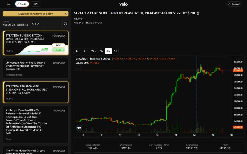
Every announcement is dated, sourced, and plotted on the chart (dotted line) — with the price impact since its publication.
The only restriction on the free tier: a 5-second delay. Five seconds change nothing for a swing trader; for a news scalper, it’s an eternity — which is exactly what the News subscription sells, with delivery via Telegram and API.
The TradFi tab: the bridge to the CME and ETFs
Since spot ETFs arrived, half of BTC’s story is now written on the traditional-finance side. The TradFi tab tracks CME futures and options — the venue where US institutions express themselves — and the table of daily ETF flows (IBIT, GBTC, FBTC, ARKB…), line by line, in millions of dollars. Inflow days of +$500M, outflow days of −$800M: that’s institutional demand breathing in and out, without ever leaving the platform.
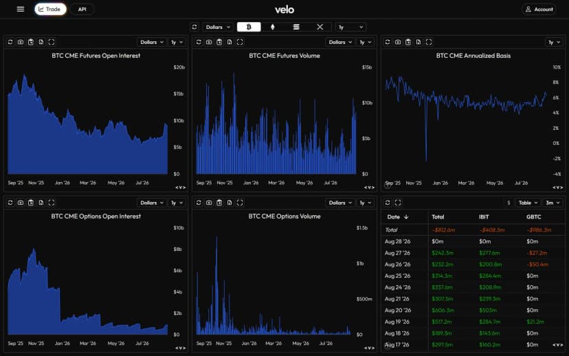
CME futures, basis, and spot-ETF flows line by line: institutional demand, without ever leaving Velo.
The Chart terminal: TradingView, supercharged with derivatives
The Chart module runs on TradingView's charting engine — candles, drawing tools, indicators, everything you already know — but wired into Velo’s aggregated data. Concretely: up to 16 panels and 32 indicators per layout, custom watchlists, and a market table of 250-plus rows where price, change, volume, and funding sort with one click — crypto and TradFi side by side. It’s the one Velo screen where trading-platform reflexes kick back in… except that no order ever gets placed.
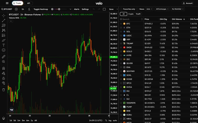
The Chart terminal: Binance-Futures candles on the left, a sortable market table (price, change, volume, funding) on the right.
Our 5-step reading routine
A dashboard has never made anyone profitable: it’s the order of the questions that makes the read. Here’s the one we apply — five minutes, five screens, always in the same order.
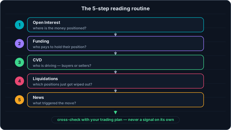
Five questions, always in the same order — and never a signal on its own.
- Open Interest. Where is the money positioned, and which way is it moving relative to price? It’s the context for everything else.
- Funding. Who’s paying to hold their position? An annualized funding rate running hot above 20-30% points to the overexposed camp — the one that will feed the cascade if it gets caught off guard.
- CVD. Who’s driving the tape — buyers or sellers? A price/CVD divergence always deserves a question.
- Liquidations. Who just got wiped out? After a cascade, leverage is purged: the move that follows starts from healthier ground.
- News. What triggered the move? A move without a catalyst doesn’t carry the same weight as a reaction to an announcement.
And the golden rule, which this guide will keep repeating to the end: these five reads document a scenario, they don’t create one. The decision stays in your trading plan — never in a tile.
Velo, Coinalyze, or TradingView? All three — just not for the same thing
The real question isn’t “which one is best,” but “which one for which use.” Our take, in one table:
| Tool | What it does best | Its limits |
|---|---|---|
| Velo Data | Multi-exchange aggregated derivatives, options, TradFi/ETF, dated news on the chart, an API, and export from every tile | No free alerts, no execution, an expensive premium |
| Coinalyze | Free futures data with alerts, immediate onboarding, our historical entry point into OI and CVD | No options, no TradFi, no news feed |
| TradingView | The best general-purpose charting tool, across every market, plus unlimited alerts | No aggregated CVD, no multi-exchange OI, no options data |
To go further within the same family: Market Monkey plays on the turf of the real-time order flow terminal, and The Kingfisher specializes in liquidation maps. Velo, for its part, is the one you open to understand the state of the market — not to trigger an entry.
Pricing: a generous free tier, a premium built for pros
| Plan | Price | What it unlocks |
|---|---|---|
| Free | $0 | All the dashboards (Futures, Options, Market, TradFi), the Chart terminal, news with a 5-second delay |
| News | $129/month (−13% billed yearly) | The news feed with no delay, also delivered via Telegram and API |
| Premium | $199/month | Everything in News + the full API: 5+ years of minute-level history, 2,750+ products, Python/TypeScript SDKs, MCP |
| Enterprise | custom quote | Velo data embedded into your own product (data, charts, or a custom package) |
Payment can be made in crypto, and our read is simple: the free tier covers 100% of the needs of a discretionary trader who reads their dashboards morning and evening. The two paid tiers only speak to two specific profiles — the news trader, for whom 5 seconds is an eternity, and the quant, who wants minute-by-minute history in their scripts.
The API, the SDKs, and the MCP: the data in your scripts — and in your AI
All the data visible on screen also exists as programmatic access (Premium plan): an API documented on docs.velo.xyz, Python and TypeScript SDKs, and direct CSV export from any tile for one-off needs. For a serious backtest — one that needs the funding actually paid or minute-by-minute OI rather than an approximation — this is the kind of source you need.
Special mention for the MCP server (Model Context Protocol): it lets you wire Velo’s data directly into an AI assistant, which can then answer “show me HYPE’s funding over 30 days” with the real numbers instead of hallucinating. In 2026, that’s still rare among crypto data providers — and it’s clearly where things are heading.
The limits, no sugar coating
- No execution. Velo is a reading room, not a trading floor: your orders stay with your broker or your exchange.
- No alerts on the free tier. Where Coinalyze wakes you up on an OI breakout, Velo assumes you’re the one coming to the data.
- Premium is a real budget item. $199/month is justified for professional use of the API — not for glancing at three dashboards a week.
- The data describes, it doesn’t predict. OI, funding, CVD, and skew tell the story of the market’s state. None of these numbers, alone or combined, is a turnkey entry signal.
- The interface is English-only — clean and consistent, but not localized into any other language.
Frequently Asked Questions about Velo Data
Is Velo Data free?
Yes, and generously so: the Futures, Options, Market, and TradFi dashboards, the Chart terminal, and the News feed (with a 5-second delay) are all accessible with no account and no card. The paid subscriptions only cover removing the news delay ($129/month) and API access with full history ($199/month).
Velo Data or Coinalyze: which one should you choose?
The two are complementary. Coinalyze remains the ideal entry point: free, immediate, with alerts. Velo goes further in breadth — options, CME and ETFs, timestamped news, an API — and its dollar-denominated CVD broken down by exchange is richer. Plenty of traders start on Coinalyze and add Velo once their questions get more specific.
Can you trade directly on Velo?
No. Velo is a data interface: you read Open Interest, funding, CVD, or ETF flows here, but you place no orders. Execution happens on your usual platform — and that’s a healthy separation of roles.
Where does Velo’s data come from?
From the exchanges themselves: Binance, Bybit, OKX, Deribit, and Hyperliquid for crypto, plus the CME and spot ETFs for the TradFi side. Velo harmonizes these feeds at 1-minute resolution and claims more than 3 billion minutes of data across roughly 3,700 products.
Is there a Velo mobile app?
No native app, but the site works as a PWA: you add it to your home screen from the browser and it behaves like an app, dashboards and charts included.
Is Velo’s CVD the same as Coinalyze’s?
The principle is identical — accumulate market buys minus market sells — but Velo displays it in dollars and breaks it down by exchange, while Coinalyze offers it aggregated and by pair. In practice, both tell the same story at the same moments; the choice comes down to comfort and working scale.
What is Velo’s MCP for?
The MCP (Model Context Protocol) lets you connect Velo’s data to a compatible AI assistant: the AI then queries the real numbers — funding, OI, minute-by-minute price — instead of answering from memory. It’s included in the Premium plan, alongside the Python and TypeScript SDKs.
Conclusion: the derivatives reading room
Velo Data has pulled off something rare: making readable on one screen what used to demand a patchwork of tabs — OI and funding by exchange, CVD in dollars, liquidations, options volatility, ETF flows, and the news that explains everything else. The free tier is generous enough to become a daily reflex, and that’s exactly the use we recommend: a reading room, opened before the trading floor.
Just keep the hierarchy pointed the right way: the data documents, the trading plan decides. If the concepts covered in this guide felt like a quick pass, every Velo tile has its own full lesson with us — Open Interest, funding, CVD, liquidity: it’s the same market, told screen by screen.
Every guide here is free. Browse the full course and join a community of traders who share ideas every day.